How good are your estimates?
As engineers, our work is inherently difficult to estimate. It’s highly contextual, it’s complex, and sometimes we are tasked with solving problems that we’ve never encountered before. Despite these challenges, our teammates need us to provide the most accurate estimates that we can.
Estimates allow our teammates and our stakeholders to come to a better understanding about the work we intend to do, which is a crucial component of clarifying expectations. We can think of estimates like a game. If we estimate correctly, then planning our work becomes much easier. If we estimate wrong, then we can waste a lot of resources and cause a lot of frustration for our teammates and our customers. Poor estimates can put our team at a significant disadvantage.
How do we improve at this estimation game?
On my current team, we improve our estimates by keeping score. All of our estimates are recorded within our work-item tracking software, and we can check the score by looking at these things called “control charts”.
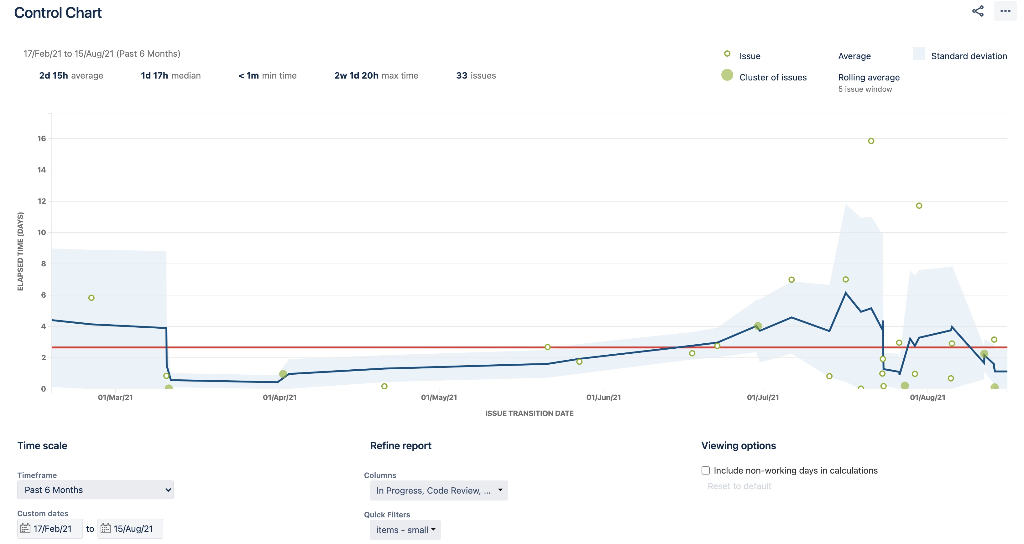
Control charts are pretty useful. They can tell you a lot about how a team or organization operates, but for right now I want to focus on what they tell us about our estimates. Take this control chart for example:
This chart represents all of the tasks that we have estimated were “small” over the last 6 months. This chart tells us that, most of the time, the tasks we classify as “small” take about 2 days to complete, give or take a day. That “give or take” is also known as our standard deviation. (I’ll touch on that chaotic part between Jul-Aug later.)
Standard deviation is key
A narrow standard deviation means that our estimates are precise. A wide standard deviation means that we are unpredictable. As you can imagine, items that we classify as “medium” and “large” have increasingly larger standard deviations (currently 3 days and 7 days for my team, respectively). This is typically due to larger goals being more complex, more risky, and by extension: more unpredictable.
So what do we do with this information?
Without these measurements, it’s not entirely clear how good we are at estimating things. The charts can help ground us to reality.
Control charts give us actionable information. Remember that chaotic part in the chart above? When we noticed the chaos, that prompted our team to start a discussion about how we are conducting our work. For example, if we notice a trend that our “small” tasks start becoming more and more unpredictable, then it could be a signal of a larger underlying issue. That issue is 100% context-specific, but from my experience I’ve noticed 5 common mistakes:
- Not fully exploring the scope of a task before it is estimated
- Scope creep, either from stakeholders or from the engineers themselves
- Overconfidence in our abilities
- Ambiguous requirements (how do we know we are “done”?)
- Technical debt
Control charts make it easy for us to spot outliers, which usually lead to fruitful discussions with the team. Questions such as “Why did this seemingly simple task take 5x longer than we estimated?” can lead to productive outcomes, provided we’re in a safe environment.
Lastly, charts serve as a regular reminder of the value of breaking large tasks down into smaller tasks. Not only are smaller tasks easier to estimate, but they are faster for us to complete, which makes it easier for us to pivot to new priorities and capitalize on new opportunities.
Interested in starting a discussion about estimates? Reach out on twitter: @another_mattr
